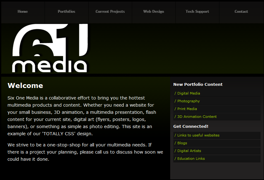
"Six One Media is a collaborative effort to bring you the hottest multimedia products and content..." This is the home page for a design/web studio created by two visual arts students. I chose this as my closure example primarily because of the use of the six and the one in the logo. The user will complete what is missing and "close" the numbers.
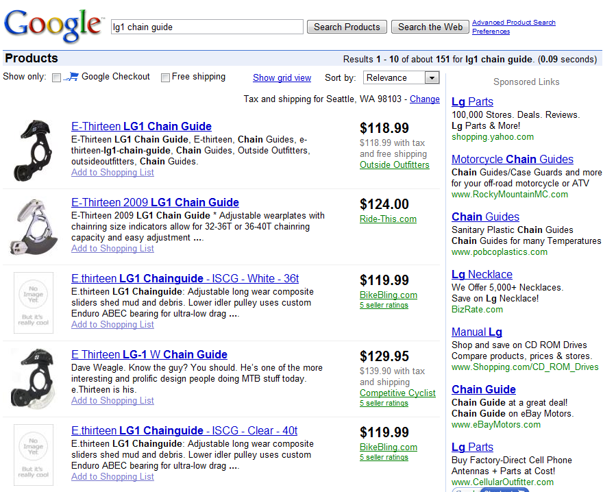
Here we see the results of a product search on google. The information displayed is a good example of continuation. We can see similar information grouped in vertical columns. This reinforces that the column information is of similar type and helps the user compare the content.
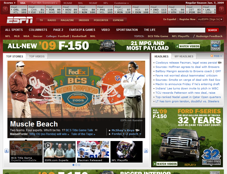
The espn homepage is very element heavy but we are able to located related elements based on their proximity to each other. Along the top we can see box scores, headlines are on the right, and the feature content is in the center left. Even when elements that are not sharing visual styles like the navigation/controls for the box scores and the scores themselves we still understand that they are related due to their close location to each other.
I chose mashable for what is happening on the right hand column. The page is very element heavy but along the right we see a series of similar element groups. Each group has their own visual style and patterns. At the top is the navigation group with icons and text in blue. The advertisement is its own group as it is dissimilar from its surroundings. The next group is the feed/subscription group where each element is a rectangle of similar dimensions. The final group seen in the screenshot is the members section where each element is a square where users can post their avatar/picture.
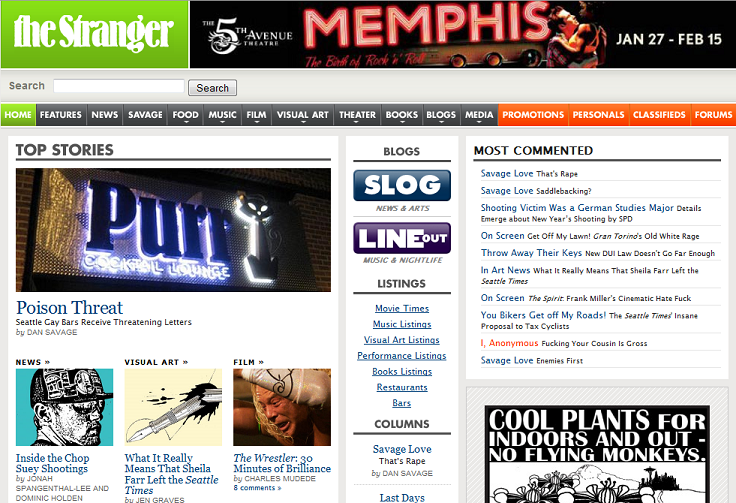
I chose the stranger's top menu as my example of uniform connectedness. At first viewing it appears that the information at the top (the top nav) are grouped together, arranged along a horizontal line, and share similar size and shape. What defines each of the main sections into their own groups is the use of color and subtle visual variance.
The Home button is green and defines itself as the most unique element of the menu. The next section are the gray content sections of the paper/website. The orange group is for the interactive applications where the primary interactions are not focused on reading stranger generated articles and content. There is also a subtle variation within the gray group. The secondary sections (food, music, film, visual art, ...) have drop down triangles associated with their button, but the primary features (features, news, savage love) do not.